Tuesday, January 19, 2010
Strange Nerd Uprising Over IKEA's Decision to Change Fonts
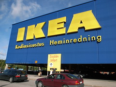
 For the past 60 years, the global home products retailer IKEA, has used the same Futura font typeface in all their catalogs and advertising. Futura has been an integral part of the IKEA brand for over half a century. But does anyone really care about a font change? Apparently yes.
IKEA's recent decision to switch to a different font called Verdana, has IKEA fanatics and font nerds everwhere fuming.
Twitter is full of annoyed tweets like...
- "Ikea decided to use Verdana for their print work. I hate that font almost as much as I hate Comic Sans."
- "Ikea, stop the Verdana madness!"
- "I can't help but be annoyed over Ikea's choice to use Verdana as their typeface in PRINT."
- "Dear Ikea, I miss your Futura ways."
- "Went to IKEA last night and truely missed Futura. I mean Verdana looks good. But.... Futura just "fit". Nothing stays the same. #ikea"
- "I do believe that Futura is my new favorite typeface! Damn IKEA for abandoning it!"
So why did IKEA make the switch? Verdana is included in both the Mac and Windows operating systems and allows IKEA to use the same font all over the world. Also, it's free... duh!
methodshop
Subscribe to Posts [Atom]